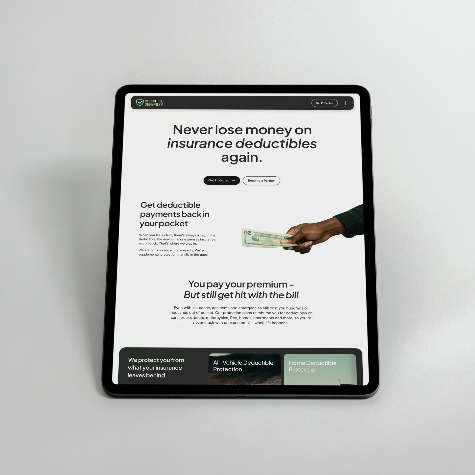
The challenge for Deductible Defender was clear: their supplemental insurance membership offered significant value, but the existing website failed to explain what it was or why it mattered. Complex service offerings were lost in a confusing user experience, creating a major barrier to conversion.
My role was to engineer a complete overhaul of the site's messaging, user experience, and user interfaces. The goal was to translate this complexity into an intuitive platform that builds trust and guides customers from education to purchase. This involved refining the brand's visual identity through new UI styles, flows, colors, and icons, incorporating this new direction as key contextual guides to make abstract services tangible.
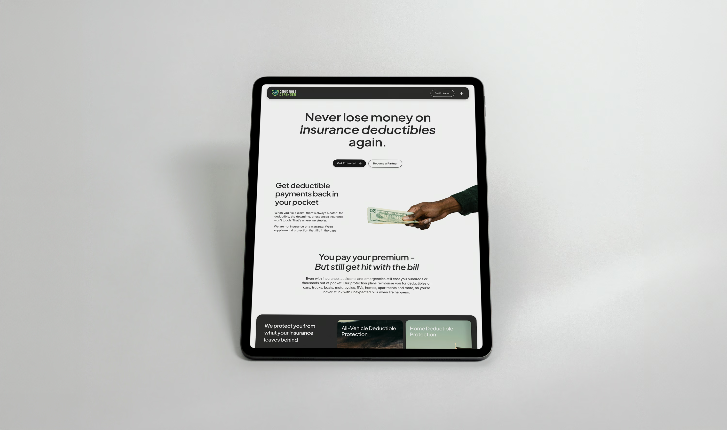
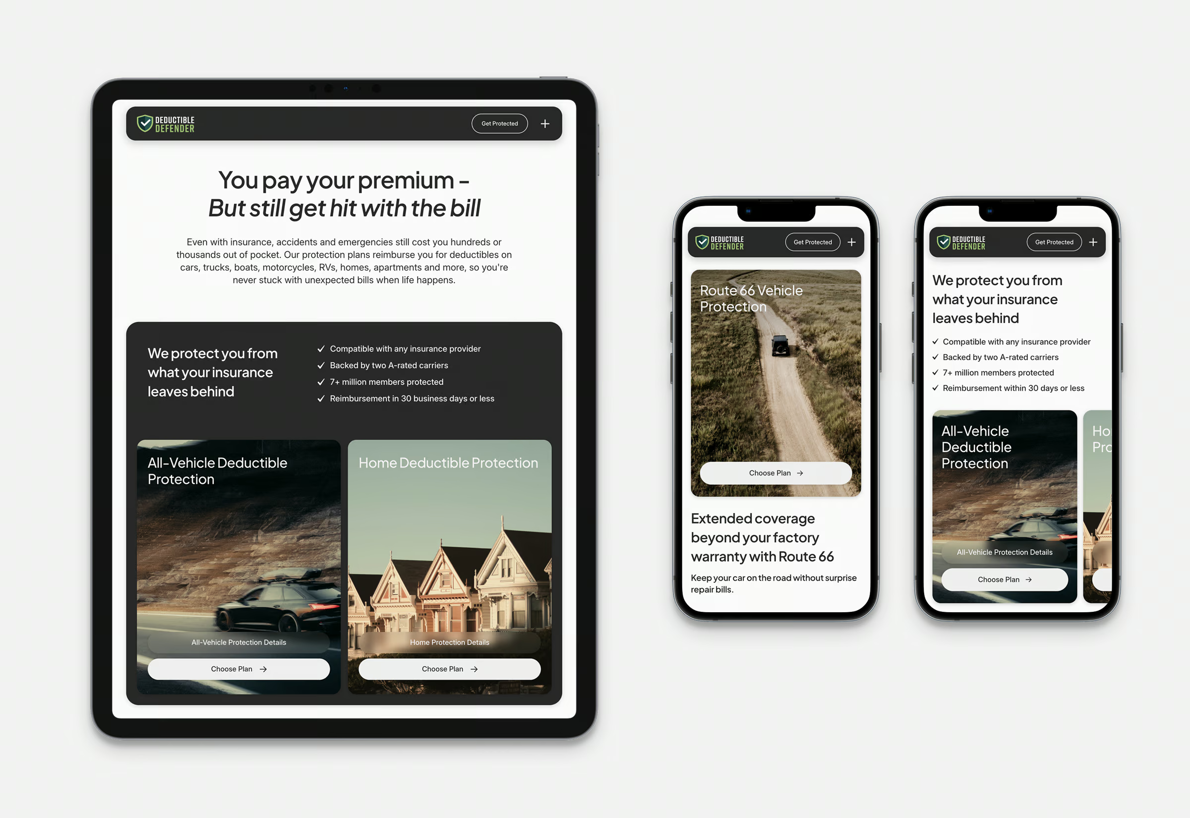
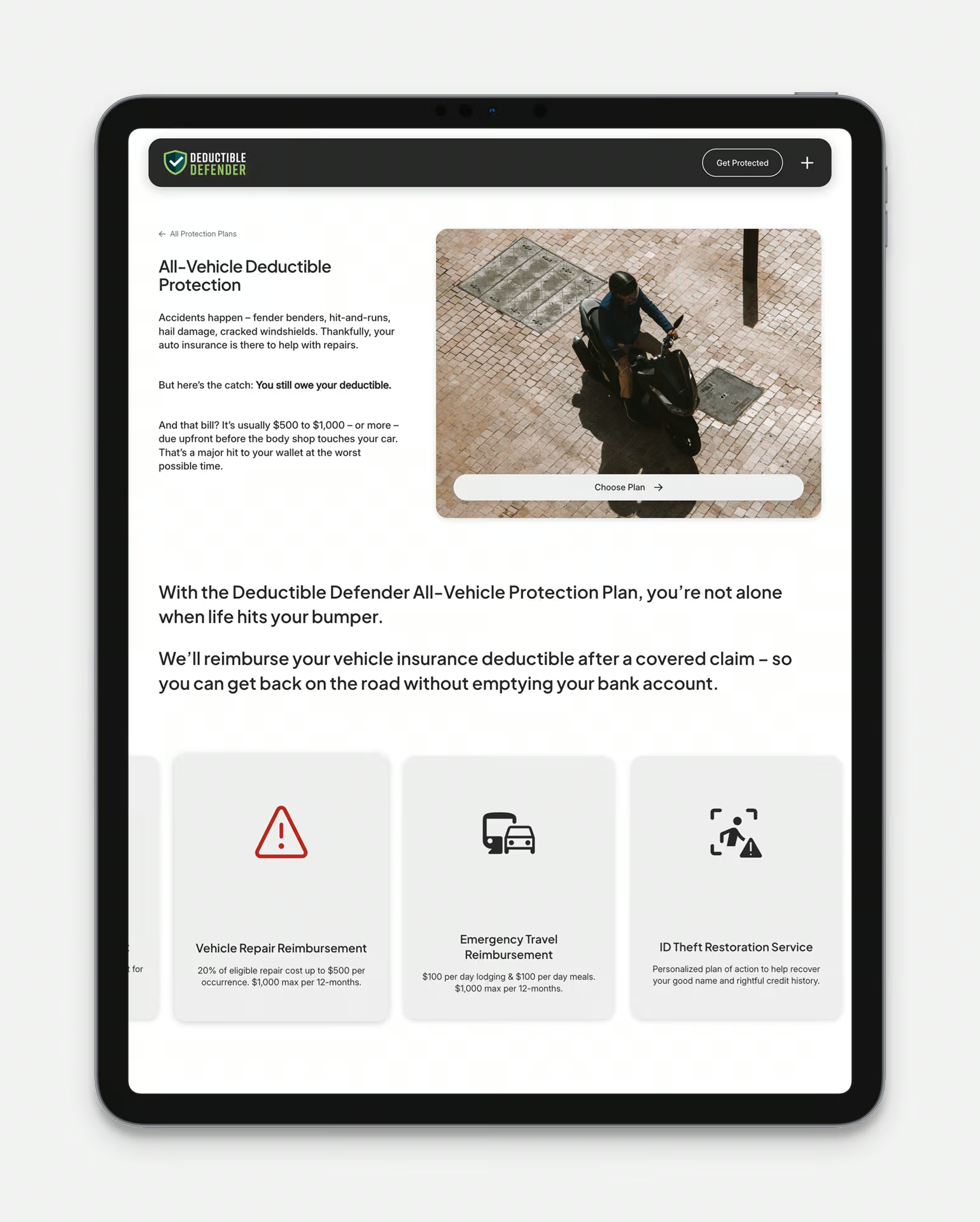
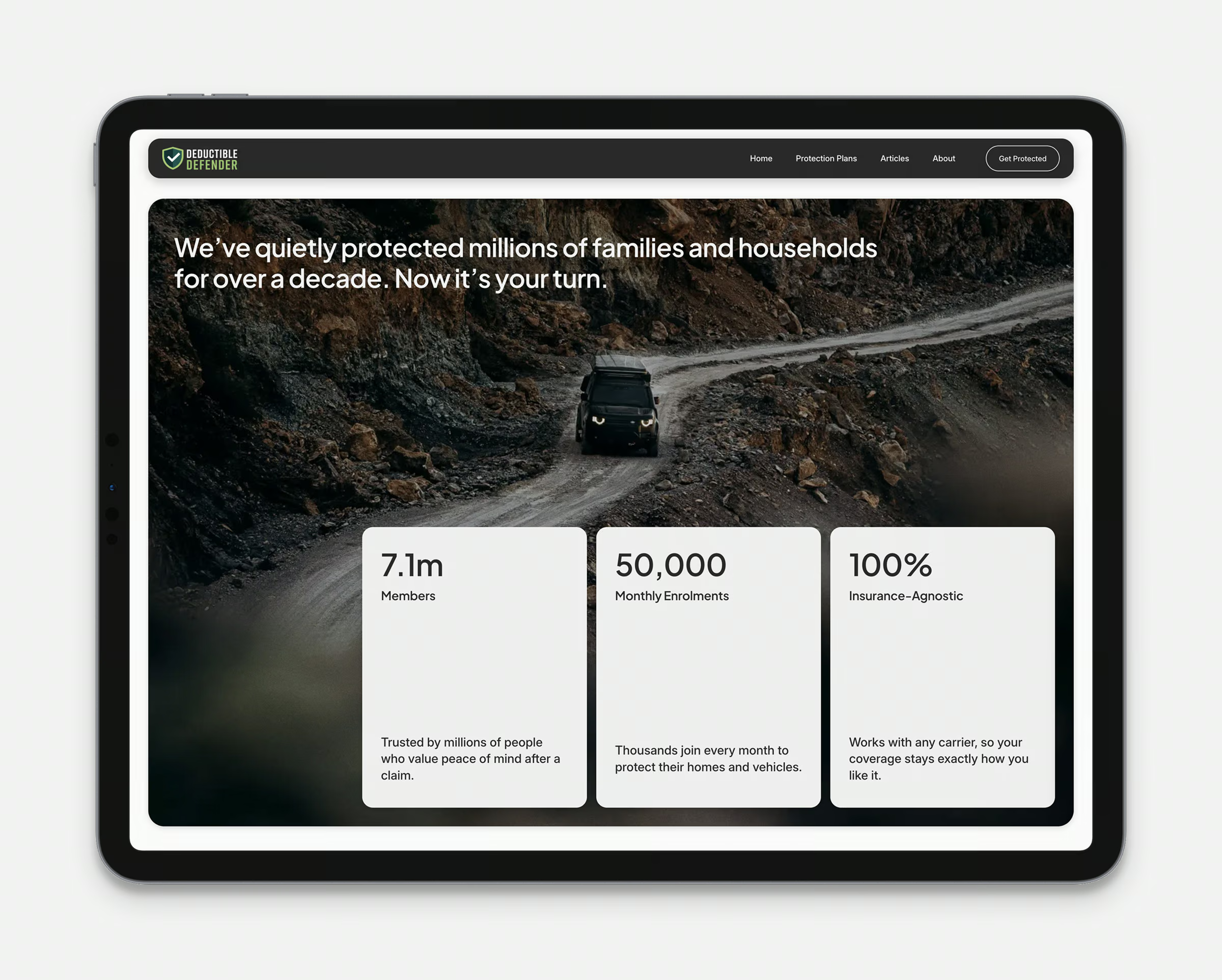
The new site architecture was anchored by an intentionally simple homepage flow—a clear hero, product explainer, and a direct path to the plans. This structure was designed to guide customers from awareness to conversion in a few scrolls, while the new CMS I developed for their service pages and blog provided clear, detailed long-form supportive content. The result is a user-centric platform that demystifies a complex product and provides a confident path to purchase.