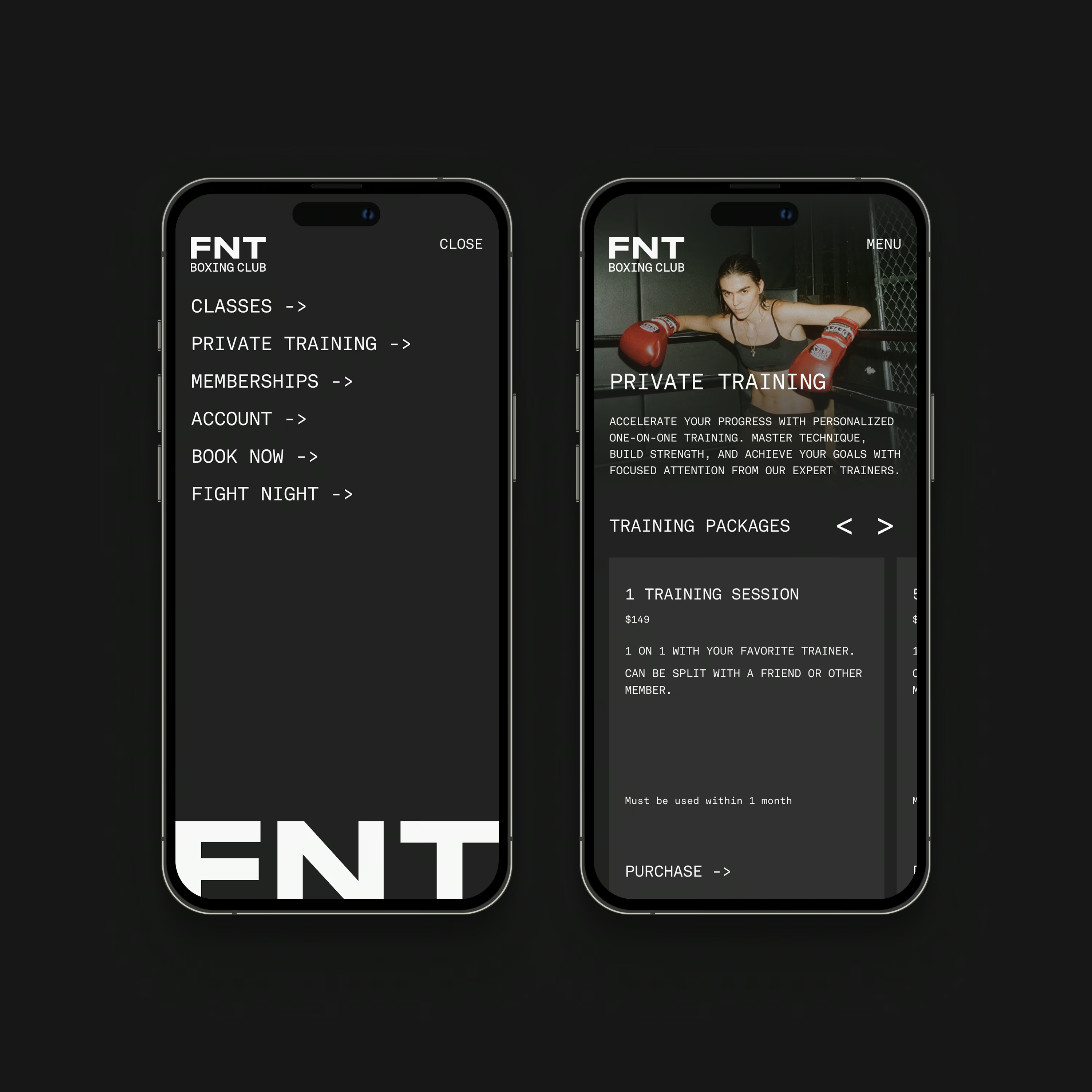
Transforming an underground fight club into a Williamsburg fitness home.


Expanding an underground legacy.
FNT began as Friday Night Throwdown, an underground fight night series dating back to 2011. When the founder decided to open a physical gym, the challenge was to evolve the brand without losing its authenticity. My task was to extend the story from late‑night fights to early‑morning training sessions, making sure the original grit carried into the new venture.
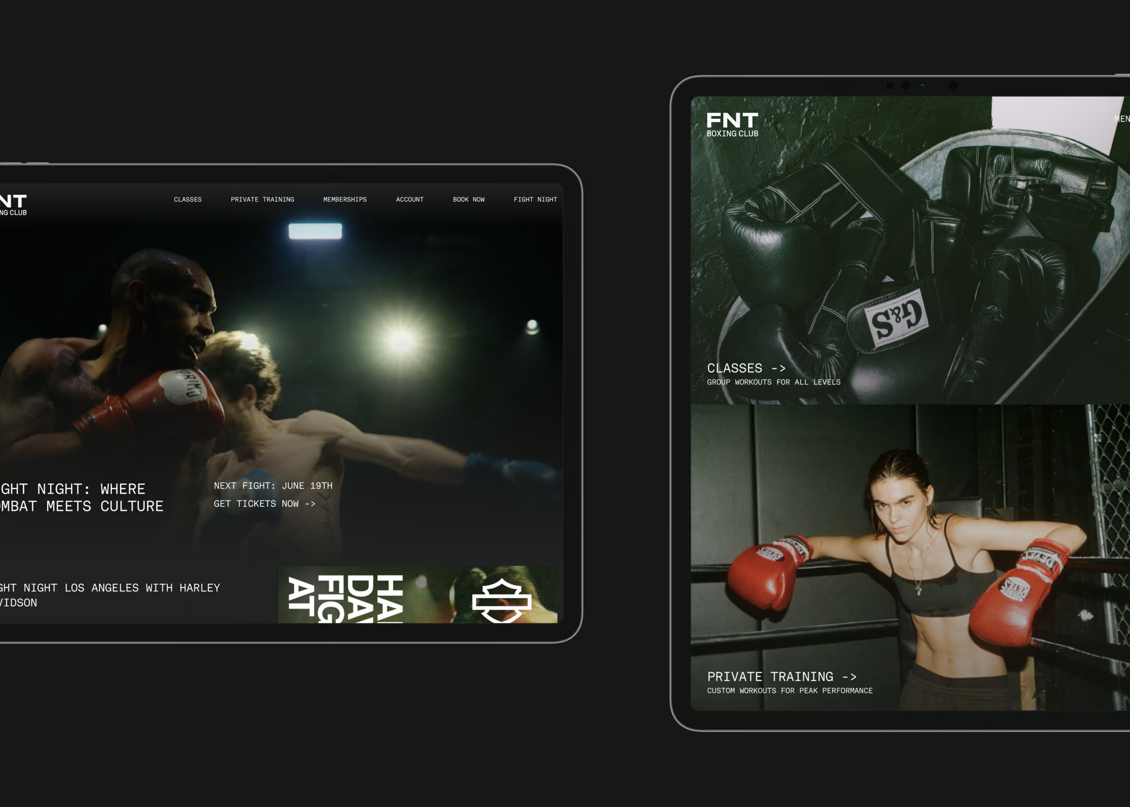
I refined the FNT mark and paired it with “Boxing Club” for instant recognition, then developed a visual language—typography, color palette, copy guidelines and UI styles—that balances toughness and accessibility. The new logo is utilitarian, carrying the existing mark forward without adding unnecessary ornamentation.









Launching with impact.
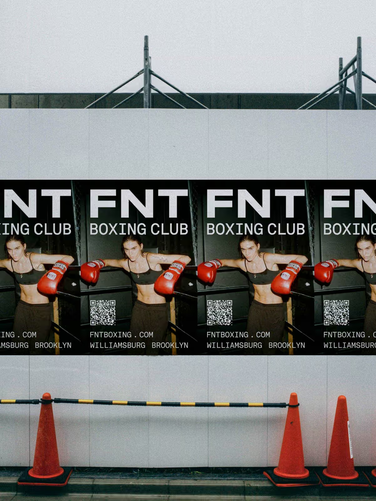
To introduce the gym, I led a multi‑channel rollout that matched the rebellious energy of the brand: eye‑catching wheat‑pasted posters across Brooklyn, bold social content and targeted emails that showcased the gym’s atmosphere and roster of experienced trainers.
The visuals emphasized the raw, no‑frills fight club vibe while highlighting the new gym space and class offerings. By tapping into New York’s appetite for distinctive fitness experiences—and offering a space that felt authentic rather than corporate—the launch generated excitement and drew in people eager to train in a place with real heritage.


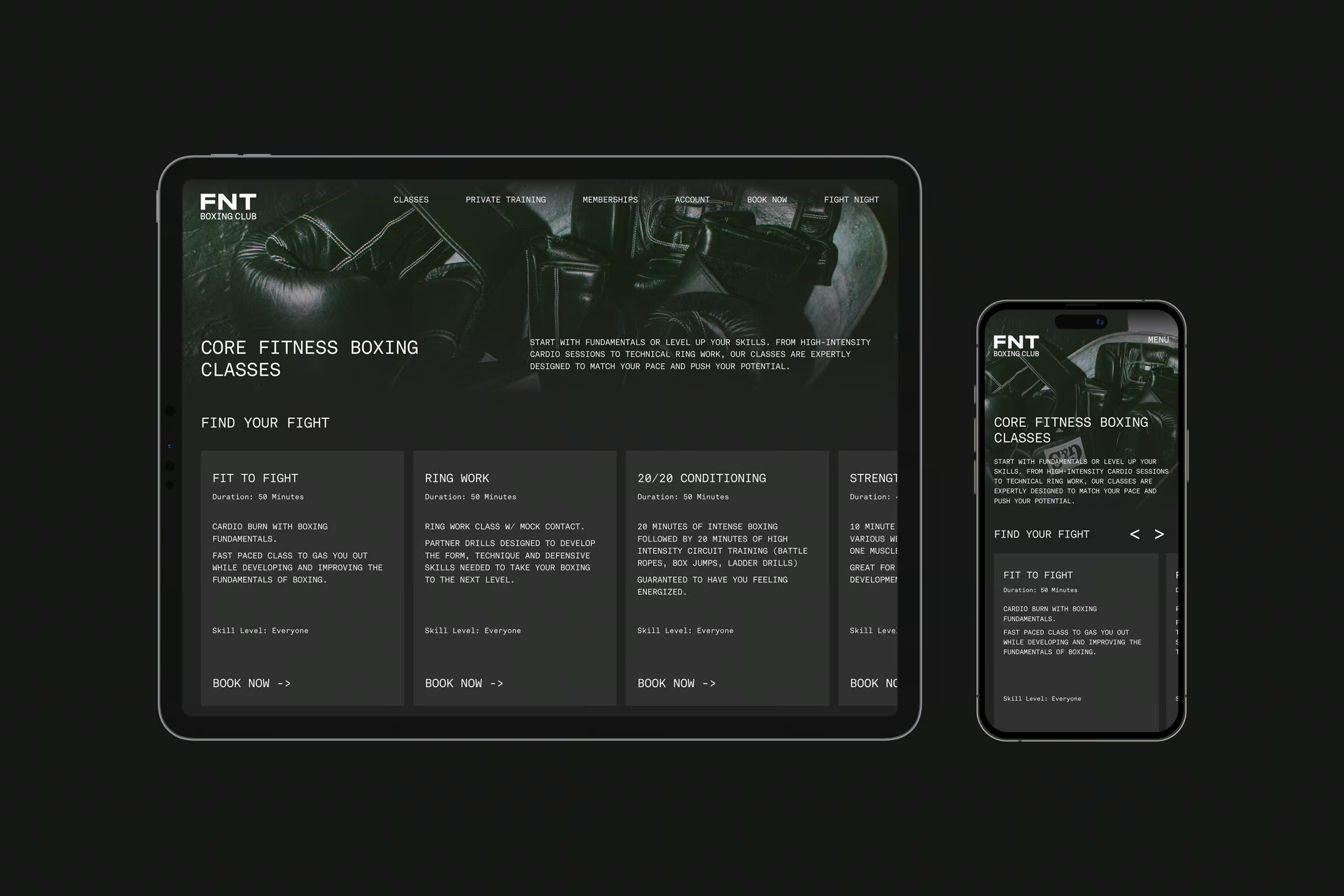


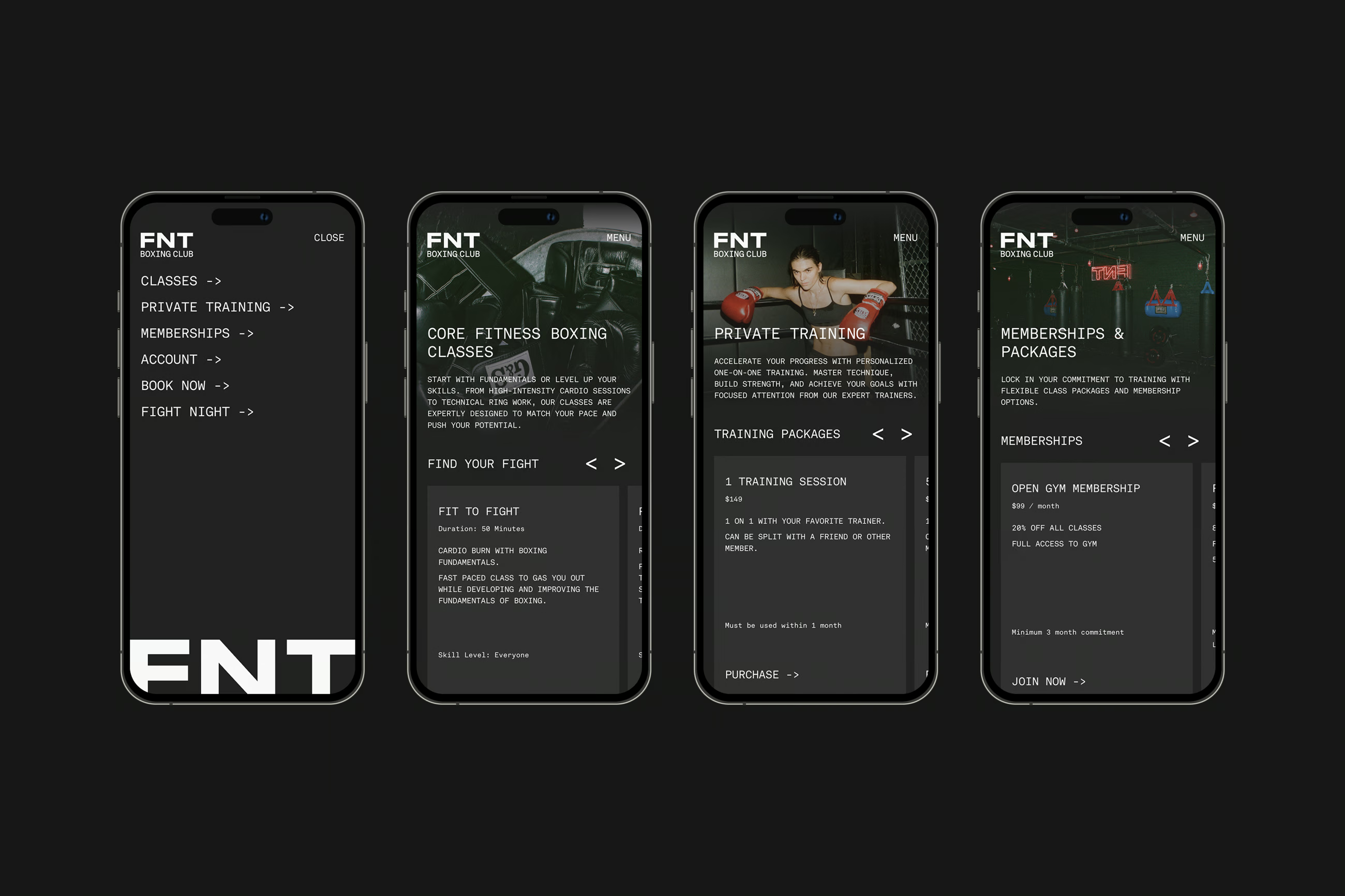
Booking and memberships seamlessly integrated.
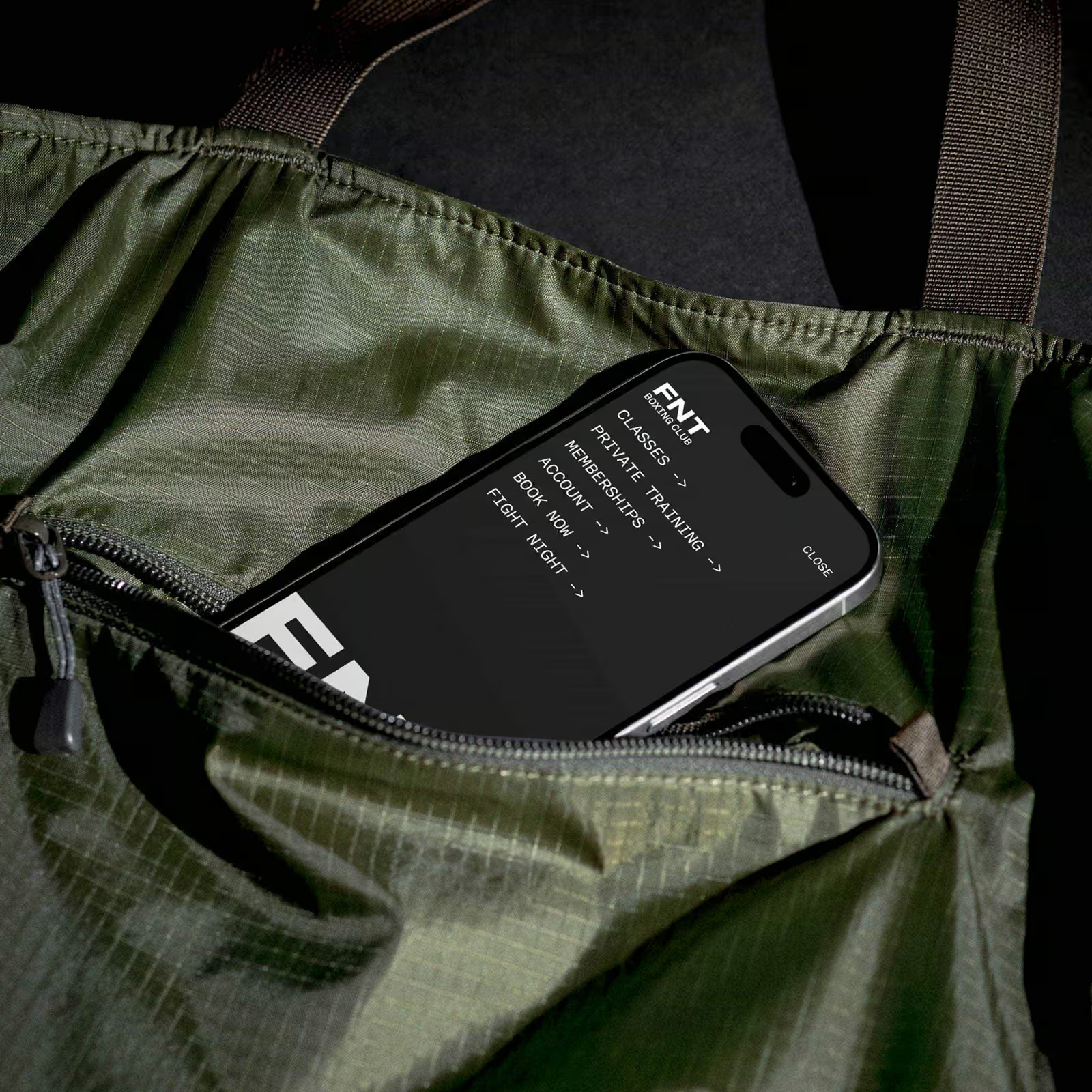
Beyond the look and feel, the site needed to function as a business engine. I designed and built a responsive website that integrates with a booking platform, allowing users to schedule classes, reserve private training and purchase memberships with ease. The user journey is straightforward: choose, book and get ready to train.


